invert_colors Color
- Material Design's color system uses tonal palettes.
- Color choices need to account for contrast, context, and meaning.
- Achieving proper contrast may require changing the On Surface color.
Overline
Headline 6
code Color activity
Learn how to build a cohesive color palette using Material Theming and industry standard contrast ratios to ensure your designs are accessible and usable for a broad range of users.
A. Choose a primary and secondary color
In Part A, you will use tools on Material.io to build a color palette mapping to Material's Primary and Secondary colors. Then you'll apply them to your project.
1
Use this tonal palette generator to choose a 500 Primary and 500 Secondary color
Play around with the palette generator. It returns nine tones of a color to choose from, but for the purposes of this activity, you should use a 500-level for both your Primary and Secondary colors.
2
Add the primary and secondary color hex codes to your theme file
Using the palettes from Step 1, click on the 500-level tone of each color to copy its hex value.
Then, paste the hex values into their respective variable in the my-theme.scss file.
Use the code snippet below as a guide.
$mdc-theme-primary: #6200ee; // Use your own value
$mdc-theme-secondary: #018786; // Use your own value
★ Design Tip
When editing colors in CSS, make sure you include a single hash symbol (#) in the beginning of your hex color values.
check Part A Complete
Check out the templates to see see how your primary color is applied across various components. Double check that text and icons are readable against the container color in all components.
B. Customize surface and on-surface colors
In Part B, you will be manipulating the color of surfaces, such as cards, menus and navigation bars, as well as the on-surface text color of these components. You'll be using Material's grey tonal palette, provided below.
1
Change your surface color from white to Grey 300
Change your surface color from white to Grey 300 (a light grey) by copying its hex value.
In your my-theme.scss file, find the $mdc-theme-surface variable and replace the color hex value with the one you copied.
You can also copy and paste the following code snippet.
$mdc-theme-surface: #e0e0e0;★ Design Tip
Check your templates and mobile view to see how the surface color is applied to different components.
2
Change your on-surface color from black to Grey 500
Use the following hex value to change your on-surface color from black to Grey 500 (a medium grey).
Paste the following code snippet into your my-theme.scss file.
$mdc-theme-on-surface: #9e9e9e;check Part B Complete
Check your templates to see how the surface and on-surface colors are applied to different components. These colors, when used together, have especially low contrast but we'll fix that in the next step.
C. Test the contrast of surface and on-surface colors
In Part C, you will use a WCAG-based color contrast checker to find the contrast ratio of your surface and on-surface colors and ensure they meet industry standards for accessibility.
1
Visit the Contrast Ratio website
In the Contrast Ratio website, you will find 2 different text fields, one for Background and another for Text Color.
2
Paste your surface color into the Background field
Copy the surface color (Grey 300) from Part B, and paste it in the 'Background' field. Remember to include the hash (#) symbol.
#e0e0e0
3
Paste in your on-surface color into the Text Color field
Copy the on-surface color (Grey 500) from Part B, and paste it in the 'Text Color' field. Remember to include the hash (#) symbol.
#9e9e9e
4
Review the resulting contrast
Once you have entered both Background and Text Color values you will see a contrast ratio number indicated
between the two fields. This number should be 2.02.
The contrast between these two colors fails WCAG AA contrast ratio standards, meaning that the text may be unreadable at small sizes for most users.
In order to pass WCAG AA standards, that number must be equal to or greater than 4.5.
We will refine your surface colors in the next step.
check Part C Complete
Check your templates and mobile view to see the effects of low-contrast components and text on a user interface. We will refine your colors in the next part of the activity.
D. Refine your surface and on-surface colors to increase contrast
In Part C, we prescribed low-contrast colors to illustrate the importance of contrast ratios and how they can enhance or detract from your design. In Part D, you will refine your surface and on-surface colors to meet contrast requirements.
1
Choose a lighter surface color and darker on-surface color
Using Material's Grey tonal palette, choose a lighter grey for a surface color, for example, Grey 200. Also choose a darker grey to use as an on-surface color, for example, Grey 800.
2
Review the contrast of your surface and on-surface colors
Use the Contrast Ratio website to check the contrast of your new colors. Enter your surface color in the 'Background' field and enter your on-surface color in the 'Text Color' field.
Repeat steps 1 and 2 until your colors pass contrast ratio requirements, i.e. until you see a contrast ratio number of 4.5 or greater.
3
Add your new colors to your SCSS file
Replace your surface and on-surface SCSS variables with your new colors by copying and pasting the hex values. Use the code snippet below as a guide.
$mdc-theme-surface: #eeeeee; // Use your own value
$mdc-theme-on-surface: #424242; // Use your own value
check Part D Complete
Check your templates to see how your surface colors have affected your components, and how they work together.
Material Templates + Color
The beauty of Material Theming is its ability to achieve vastly different visual results just by changing a few lines of code. Using the templates in the navigation menu, complete the challenges below to learn advanced techniques in customizing Material Components.
Express brand with color using the login screen template
1. Add custom brand colors
In the Color Activity, you were given specific color values. The challenge is to add custom colors to your theme that express brand and meet contrast requirements. Use the code below as a guide.
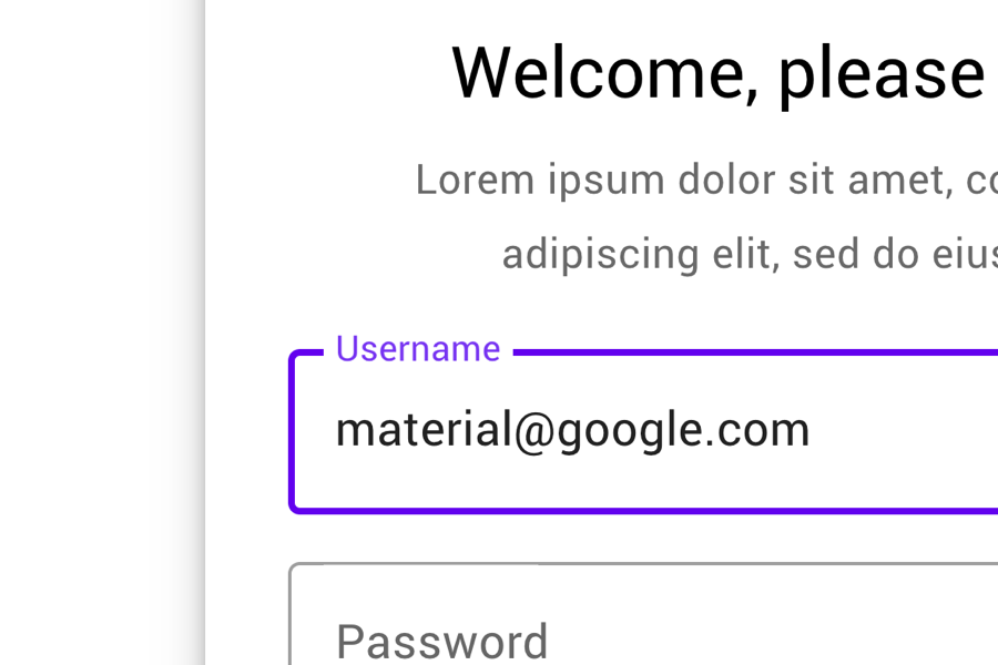
2. Customize the text field's focus color
By default the active state of the text field component uses a theme's primary color. The challenge is to use a different color than your primary or secondary color. Remember, the color should still meet contrast requirements.
$mdc-theme-primary: #6200ee; // 1. Replace with custom brand colors
$mdc-theme-secondary: #018786; // 1. Replace with custom brand colors .mdc-text-field {
@include mdc-text-field-focused-outline-color($color);
}
// 2. Replace $color with a new focus color